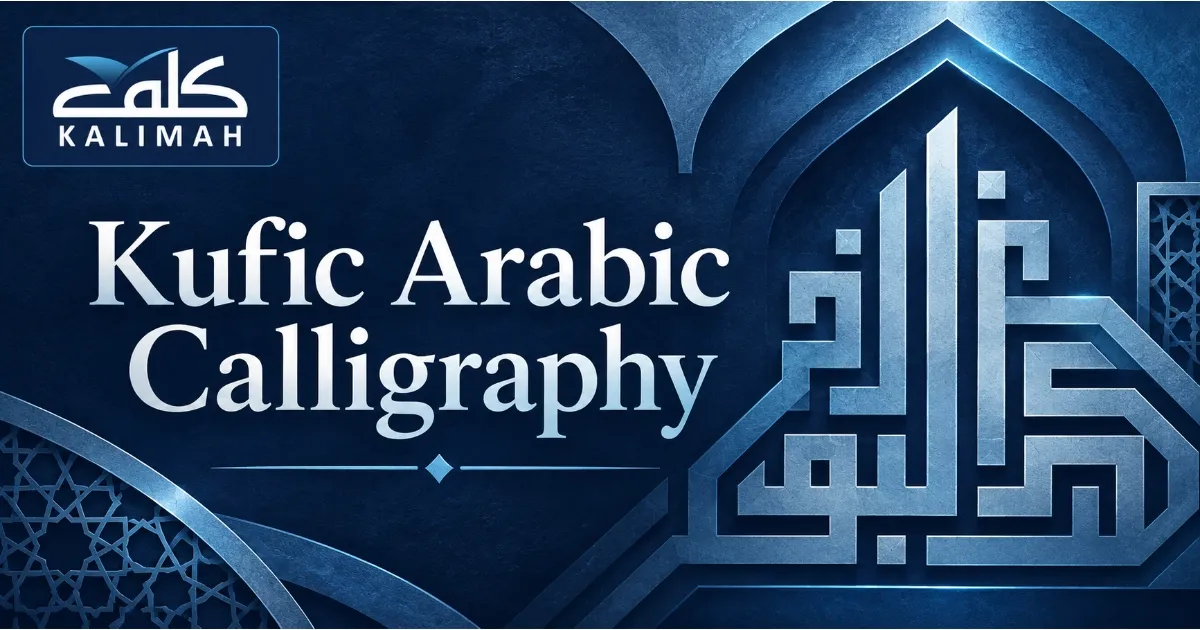
You can see it on an old mosque wall, on a 1,000-year-old Quran page, or in a modern logo from the Gulf: letters made of straight lines and sharp corners. That is Kufic Arabic calligraphy, the oldest major style of Arabic script and still one of the boldest.
Flowing cursive scripts curve and slope, but Kufic works almost like architecture on paper. Its letters stretch, stack, and lock into grids. That’s why designers, artists, and curious learners keep coming back to it centuries after it left everyday use.
At Kalimah Centre, many of our students first fell in love with Arabic through its beauty, before they could read a single word. If that sounds like you, this guide is for you, whether you want to decode Kufic inscriptions or draw them yourself.
We’ll start with where the script came from and the visual rules behind it. Then we’ll look at its main styles and finish with a hands-on method for drawing your first square Kufic word, using free tools you can open today.
Here’s what this guide covers:
- Where Kufic began, and why early Quran copyists relied on it.
- The visual rules that make Kufic letters easy to recognize.
- How early, ornamental, and square Kufic differ.
- A step-by-step grid method, plus free tools to start practicing.
What Is Kufic Arabic Calligraphy And Where Did It Come From?
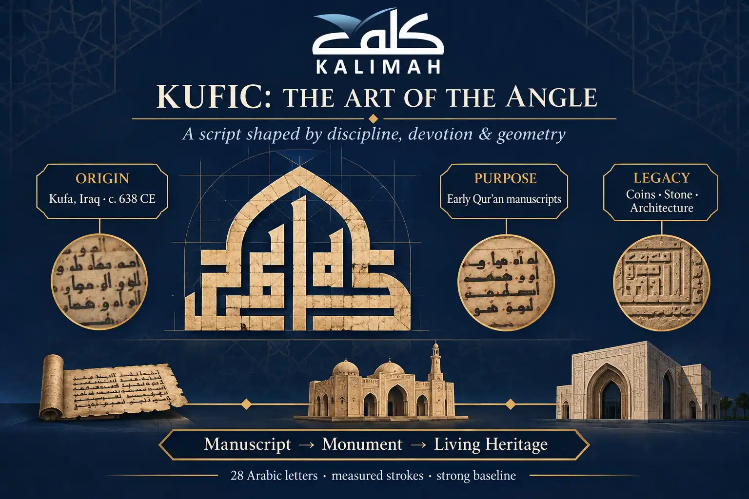
Kufic Arabic calligraphy is an angular, geometric style of Arabic script. It is named after the city of Kufa in Iraq, and it was the main script for copying the Quran in the early Islamic centuries. Before you draw it, it helps to know why it looks so monumental, and the story starts in one of Islam’s earliest cities.
The Origin Of Kufic Script In Kufa, Iraq
Kufa was founded around 638 CE as a garrison town. It quickly became one of the busiest centers of learning in the early Islamic world. Scholars, Quran reciters, and scribes gathered there, and the angular hand they refined came to carry the city’s name.
Historians point out that the name may reflect prestige more than an exact birthplace, because angular Arabic writing also existed in other regions. For a concise scholarly overview of how the style developed, check out Britannica’s entry on the Kufic script.
For you as a learner, the important thing Kufa left behind is the idea of writing as a disciplined, measured craft. Every Kufic letter sits on a firm baseline with deliberate proportions. That discipline is the first habit you’ll build when you start Kufic Arabic calligraphy.
Why Kufic Was Chosen For Early Quran Manuscripts
Early Muslims treated the written Quran with deep reverence, so copyists needed a script that looked dignified, stable, and monumental. Kufic’s slow, measured strokes suited that purpose. The earliest surviving Quran copies, from the 8th to the 10th centuries, were written in it.
Allah, Glory be to Him, says in the Quran:
“ٱلَّذِى عَلَّمَ بِٱلْقَلَمِ”
“Who taught by the pen.” (Surah Al-Alaq, 96:4)
This verse comes from the first passage of the Quran to be revealed, and it puts the pen at the heart of human knowledge. It helps explain why Muslim scribes took such care with the shape of every letter. For them, copying revelation became a careful art of devotion.
One famous example is the “Blue Qur’an,” written in gold Kufic letters on indigo-dyed parchment, probably in Tunisia. As highlighted on The Met’s digitized folio page, its scribe stretched and compressed letters so that every line ends at exactly the same length.
If pages like these make you want to read the Quran itself with confidence, Kalimah Centre’s Online Quran Course takes you from Noorani Qaida through Tajweed with native tutors. The text behind the art becomes something you can recite correctly.

How Kufic Moved From Manuscripts To Coins And Architecture
Kufic didn’t stay on parchment. Its straight strokes adapted well to hard surfaces, so it appeared on coins, tombstones, ceramics, textiles, and building inscriptions. Carvers needed letters that kept their shape in stone, brick, and metal, and Kufic delivered exactly that.
Around the 12th century, rounder cursive scripts such as Naskh took over everyday copying because they were quicker to write and easier to read. Kufic didn’t disappear, though. It moved into a decorative role, framing domes, doorways, and borders in striking contrast to cursive text.
That long life is part of why Arabic calligraphy was added to UNESCO’s Representative List of the Intangible Cultural Heritage of Humanity in 2021. To see how the practice is defined and passed on today, refer to UNESCO’s official heritage listing.
Every Kufic masterpiece starts with the same 28 letters.
Learn them properly with Kalimah Centre’s native Arabic tutors, and the art on the wall will start to speak to you.
Read Also: The Complete Arabic Alphabet Guide: Letters, Forms, Sounds & Practice
The Visual Rules That Define Kufic Letterforms
Before you pick up a pen, it helps to know what gives Kufic Arabic calligraphy its distinctive look. A handful of visual rules appear in almost every Kufic piece. Once you can name them, you’ll start recognizing the script everywhere, from museum cases to street murals.
1. Straight Lines, Right Angles, And Horizontal Stretching
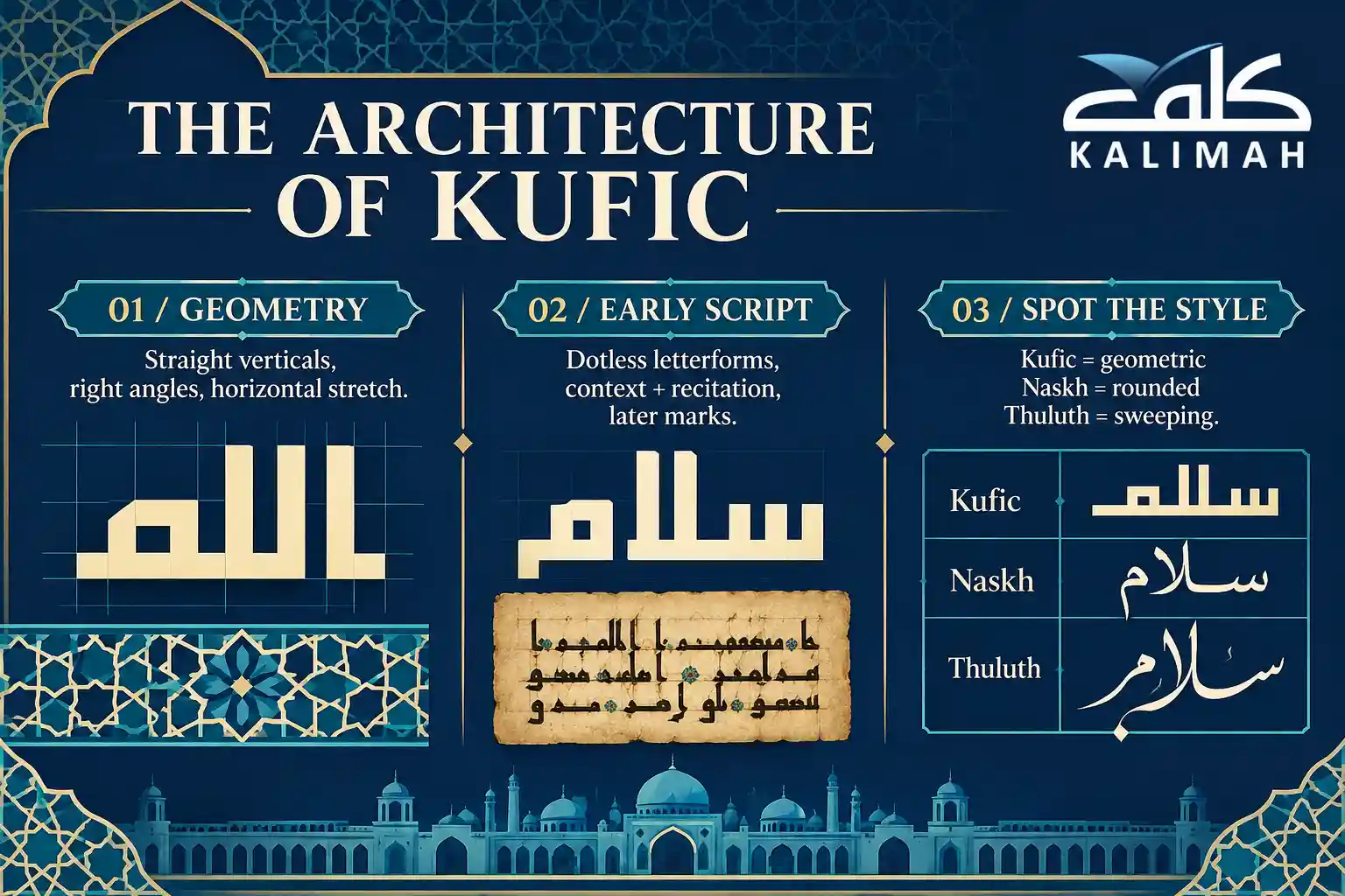
Kufic is built from straight lines and sharp angles rather than soft curves. Vertical letters such as alif and lam rise as tall, upright strokes, while the bodies of the letters sit flat and broad on a strong baseline. The result is a grounded, almost architectural line of text.
Early scribes also stretched certain letters horizontally, a technique often called mashq. The stretching had a job to do: it let calligraphers balance a line, fill the space evenly, and create the calm, wide rhythm you see in early Quran pages.
When you practice, treat these features as rules. Keep vertical strokes truly vertical and the baseline level. Stretch only the letters that naturally allow it, such as the connecting strokes between ba, ta, and similar shapes, or your design will quickly feel unbalanced.
2. Letters Without Dots – How Early Kufic Was Read
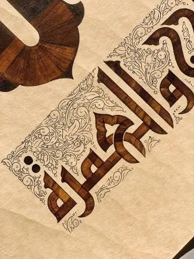
Many early Kufic texts leave out the dots that tell similar letters apart, so ba, ta, and tha can look identical. Readers relied on context and memory. This was especially true for the Quran, which was preserved first and foremost through careful recitation.
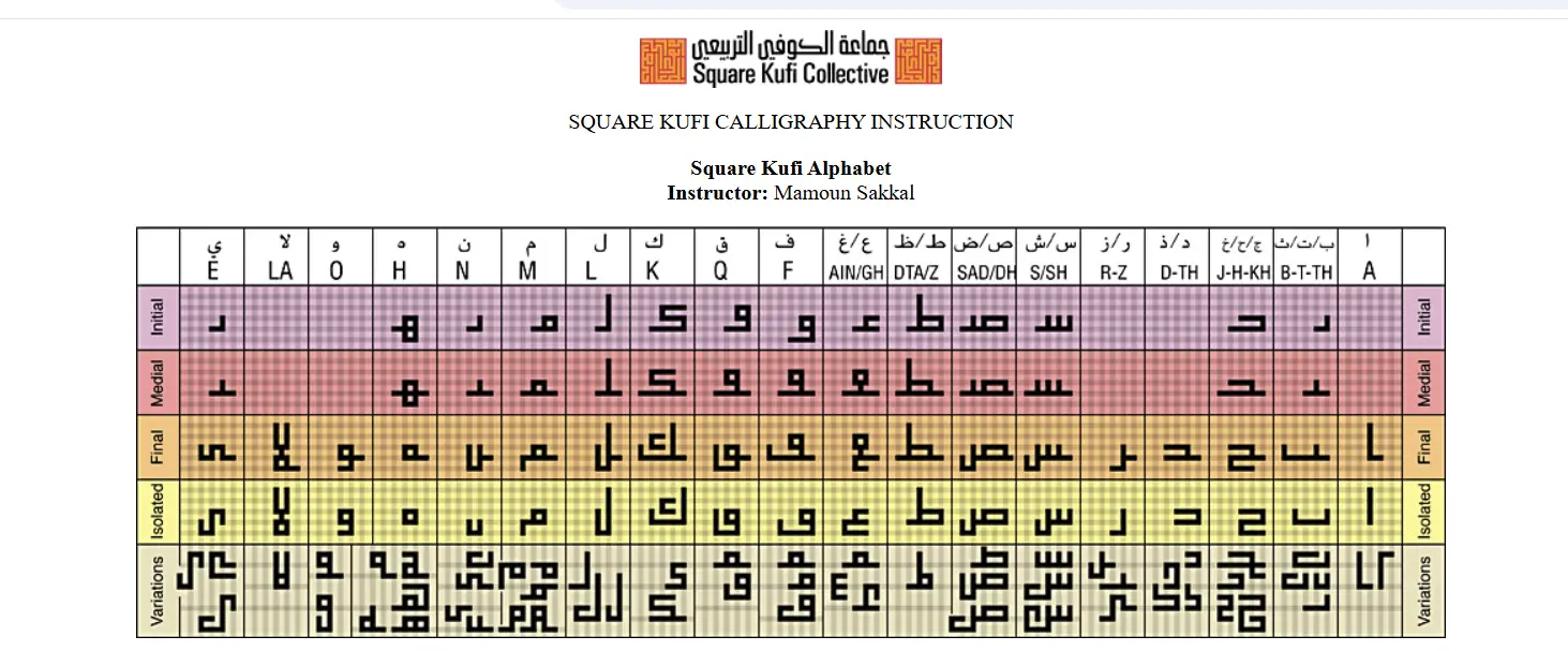
Over time, scribes added systems of marks, including colored dots for vowels and small strokes to tell consonants apart. Square Kufic often keeps the older dotless approach. You can check every letter shape in Mamoun Sakkal’s free Square Kufi alphabet chart.
This is where language skills give you an edge. Kalimah Centre’s Online Arabic Course starts with the full alphabet and its letter shapes, so you learn the basic skeleton of each letter that Kufic artists build on. After that, dotless forms stop feeling like a riddle.
3. How To Tell Kufic Apart From Naskh And Thuluth
The quickest test is to look at the curves. Naskh is rounded, compact, and very readable, which is why most printed Arabic books use it. Thuluth is tall and sweeping, full of elegant loops. Kufic, by contrast, looks boxy, flat, and deliberately geometric.
Next, check the proportions. Kufic letters tend to be wide and low, with tall vertical strokes, while cursive scripts slope, overlap, and stack diagonally. If a piece looks as though it could be built from bricks or tiles, you’re almost certainly looking at some form of Kufic.
Being able to read the words, and not just spot the style, makes every visit to a museum or mosque richer. Kalimah Centre’s Arabic Reading Course trains you step by step on letter forms, vowels, and connections, so inscriptions turn into sentences you understand.
Recommended reading: How to Write in Arabic: Step-by-Step Guide for Beginners
The Main Styles Of Kufic Calligraphy
Kufic isn’t one single look. It’s a family of styles that developed over centuries and across regions. Knowing the main branches of Kufic Arabic calligraphy helps you decide which one to study first and which features to borrow when you start your own designs.
1. Early Kufic Used In Quran Manuscripts
Early Kufic, sometimes called Mushaf Kufic, is the style of the oldest Quran copies. The pages are usually wider than they are tall, with only a few lines of large letters on each page, generous spacing, and the horizontal stretching described above.
The style feels calm and monumental. Letters are thick, the ink is dense, and the beauty comes from rhythm and balance more than from ornament. That makes it an excellent study model for anyone who wants to train their eye for proportion and spacing.
Modern designers still borrow from it. According to its specimen page, the free Reem Kufi typeface on Google Fonts is based on early Kufic models and adapted to the Fatimid Kufic grid. You can type a phrase, study its shapes, and trace them by hand.
2. Foliated, Floriated, And Plaited Kufic
As Kufic moved onto buildings and objects, artists began to decorate it. In foliated Kufic, the ends of letters sprout leaf-like shapes. Floriated Kufic goes further, adding flowers and scrolling vines in the background or growing them out of the letters.
Plaited, or interlaced, Kufic ties the tall vertical strokes into knots and braids, turning a single word into an ornamental band. These styles are especially common on ceramics, metalwork, and stone friezes, where calligraphy also served as a decorative border.
It helps a lot to watch these styles being made. In this free video on Kufic lettering across manuscripts and ceramics, you can see how much a letter changes once leaves, knots, and glazes are added, even though its basic skeleton stays the same.
3. Square Kufic And Its Grid-Based Design
Square Kufic, known in Arabic as Kufi Murabba, is built entirely on a grid of equal squares. Every stroke has the same thickness and every turn is a right angle. The spaces between letters matter just as much as the letters themselves.
The style is best known from glazed brickwork and tiles on mosques and historic buildings, where the name “Allah” and short phrases of praise repeat in geometric patterns. Because each design fits inside a square, it can be rotated and repeated to cover entire walls.
Square Kufic is also a great starting point for young learners, because drawing it feels like solving a puzzle on graph paper. Kalimah Centre’s Arabic Classes For Kids build children’s alphabet and writing skills with native tutors, which gives their grid art real meaning.
Related read: Arabic Writing Practice for Kids: Expert Tips With 3 Worksheets
3. Square Kufic And Its Grid-Based Design
Square Kufic, known in Arabic as Kufi Murabba, is built entirely on a grid of equal squares. Every stroke has the same thickness and every turn is a right angle. The spaces between letters matter just as much as the letters themselves.
The style is best known from glazed brickwork and tiles on mosques and historic buildings, where the name “Allah” and short phrases of praise repeat in geometric patterns. Because each design fits inside a square, it can be rotated and repeated to cover entire walls.
Square Kufic is also a great starting point for young learners, because drawing it feels like solving a puzzle on graph paper. Kalimah Centre’s Arabic Classes For Kids build children’s alphabet and writing skills with native tutors, which gives their grid art real meaning.
Your child’s first Arabic word could also be their first piece of art. Kalimah Centre’s patient female tutors turn letters into confidence, one playful lesson at a time.
Experience Kalimah Center Classes
Watch real excerpts from our live sessions at Kalimah Center and see how we bring learning to life. These clips highlight our interactive, student-centered teaching approach across all our courses—designed to keep learners engaged, motivated, and actively involved every step of the way.
Master Arabic with Kalimah Center
Join our expert-led online classes and start your journey toward Arabic fluency today.
Book Your Free TrialHow To Start Practicing Kufic Arabic Calligraphy Step By Step
One of the best things about Kufic Arabic calligraphy is that you don’t need expensive equipment or years of pen training to begin. A ruler, some squared paper, and a clear method are enough to produce your first clean, balanced design in a single afternoon.
1. Tools You Need For Paper And Digital Practice
For paper practice, start with squared graph paper, a sharp pencil, an eraser, and a ruler. Add a couple of black fine-liners or chisel-tip markers for inking. Later, if you want a more traditional feel, a broad-nib reed pen (qalam) works beautifully for early Kufic.
Prefer working on a screen? Inkscape, a free vector design program, lets you turn on a grid, snap shapes to it, and build square Kufic designs cell by cell. It’s easy to fix mistakes there and export clean files for printing or social media.
If you enjoy freehand sketching, Krita’s free, open-source painting app gives you brushes, layers, and rulers for tracing early Kufic letters. Keep a reference font open next to it, and you have a complete practice studio without spending anything.

2. Writing Your First Square Kufic Word On A Grid
Choose a short word with simple letters. A lovely first project is “كلمة” (kalimah), which means “word.” Draw a grid of about 9 by 9 cells, and set two rules: every stroke is exactly one cell thick, and there is at least one empty cell between strokes.
Next, sketch each letter as blocks, working from right to left. Check each shape against your reference chart, let tall letters like lam reach toward the top of the grid, and join the letters along a shared baseline. Then shade the strokes and check that the empty spaces feel evenly balanced.
Watching an expert build letters helps you pick up the rhythm. Follow along with this free freehand Kufic demonstration on YouTube, pausing to copy each step. Then go back to your grid and refine your word until every line looks intentional.
3. Common Beginner Mistakes And How To Fix Them
The most common mistake is uneven stroke width, where some strokes grow thicker than one cell. To fix it, outline every stroke in pencil before you shade, and count the cells along each line. Consistent stroke width is what makes square Kufic look professional.
Another frequent problem is ignoring negative space. In Kufic, the white gaps are part of the design, so crowded areas make a word hard to read. Squint at your work or turn it upside down, and uneven patches of dark and light will jump out right away.
The third mistake is a spelling error, such as letters in the wrong order or a missing letter, which is easy to make before you can read Arabic. Learning with others helps, and Kalimah Centre’s Arabic Group Classes build reading and writing skills alongside fellow learners at a lower cost.

Further reading: Learn to Read and Write Arabic: Complete Beginner’s Guide (+ Speaking)
Build The Arabic Literacy Behind Every Design With Kalimah Centre
A calligraphy design is only as good as the words inside it. One misplaced letter in a Kufic tile can change its meaning, and an artist who can’t read the text has no way of noticing. That’s why the strongest calligraphers are, above all, confident readers of Arabic.
Kalimah Centre builds that confidence through live lessons with instant correction. Your native-speaking tutor follows how you read and write in real time and corrects mistakes on the spot. That way, the shapes you love are always matched to the right sounds, spelling, and meaning.
You also choose how you learn: one-on-one or in a small group, with a male or female tutor, on a schedule that fits your week. Your learning materials are available 24/7, which helps when you want to check a letter form late at night in the middle of a design.
As you progress, you earn a certificate for each level you pass, so you have a clear record of your growth. Combine that structured path with your grid practice, and Kufic Arabic calligraphy stops being something you admire from a distance and becomes a skill of your own.

Inside Kalimah Center: Moments from Our Courses
Get a glimpse into the vibrant learning experience at Kalimah Center. These snapshots capture real moments from our live classes—where students engage deeply, connect with passionate instructors, and grow in a welcoming, supportive environment.
Master Arabic with Kalimah Center
Join our expert-led online classes and start your journey toward Arabic fluency today.
Book Your Free TrialBook Your Free Trial Arabic Class With Kalimah Centre Today
Book a free trial class with Kalimah Centre today and meet a native Arabic tutor who will assess your current level, listen to your goals, and map out your first steps with you.
Setting up your trial takes only a few minutes, and there’s no commitment. Bring your questions about the alphabet, about reading, or about the Quranic phrases you’d love to turn into art. You’ll leave with a clear, personal learning plan.
???? Explore Our Courses:
Online Arabic Course: Tailored to your level, our comprehensive Arabic program includes 16 teaching levels and 400+ hours of personalized sessions.
Online Quran With Tajweed Course: Perfect for non-Arabic speakers, our course spans 13 levels and equips you with Tajweed mastery from beginner to advanced.
Online Arabic Course For Kids: Nurture your child’s love for Arabic with our engaging and structured program, available in 24 levels for primary, intermediate, and secondary stages.
Don’t let another beautiful inscription stay a mystery. Claim your free trial class at Kalimah Centre now and take your first real step from admiring Arabic art to reading and writing it with confidence.

Master Arabic with Kalimah Center
Join our expert-led online classes and start your journey toward Arabic fluency today.
Book Your Free TrialConclusion
Kufic began as the dignified script of Kufa and of the earliest Quran manuscripts. From there, it spread to coins, ceramics, and architecture, and in time it grew into a family of styles: monumental early Kufic, ornamental foliated and plaited forms, and the precise, grid-based square Kufic that designers still love.
Along the way, you’ve learned the visual rules that set Kufic apart: straight strokes, firm baselines, horizontal stretching, and dotless forms. You’ve also seen how to tell it apart from Naskh and Thuluth, and how free tools, from vector software to open fonts, can turn a laptop into a practice studio.
The main takeaway is that Kufic Arabic calligraphy rewards two skills working together: a steady hand on the grid and a solid knowledge of Arabic letters. Start with one short word, keep your strokes even, protect your negative space, and let your reading skills check every design.
Frequently Asked Questions
Is Kufic Calligraphy Hard For Beginners?
No, square Kufic is one of the easiest styles to start with, because it relies on a grid instead of pen control. Kalimah Centre’s tutors help you master the letters that make that grid work.
Can I Learn Kufic Without Knowing Arabic?
You can copy the shapes, but without reading Arabic you risk spelling mistakes that change the meaning. Kalimah Centre teaches you the alphabet and reading so every design you make is accurate.
What Is The Difference Between Kufic And Naskh?
Kufic is angular and geometric, while Naskh is rounded, compact, and used in most printed Arabic texts. Kalimah Centre’s reading lessons train your eye to recognize both scripts with confidence.
What Tools Do I Need To Start Square Kufic?
You need squared paper, a pencil, a ruler, and a black marker, or free design software on your computer. Alongside that, Kalimah Centre gives you the letter knowledge to draw each word correctly.
How Long Does It Take To Draw Square Kufic Well?
Most beginners can produce a clean single word within a few practice sessions, and fuller designs within a few weeks. Steady Arabic lessons at Kalimah Centre make that progress faster and more accurate.